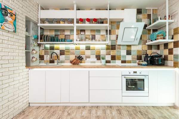
Kitchen splashbacks are becoming far more than a practical surface behind the hob or sink. In 2026, they are expected to play a leading role in the room, bringing colour, texture and personality into spaces that have often relied on safe neutrals. The strongest kitchen splashback tile trends 2026 reflect a wider move towards kitchens that feel expressive, comfortable and connected to the rest of the home.
Homeowners can choose a finish that suits their space, whether that is a bold graphic pattern, warm terracotta, softly uneven handmade ceramics or a familiar tile arranged in an unexpected way. The key is to treat the splashback as part of the design rather than a last-minute practical decision.
Patterned tiles take centre stage
Patterned splashback tiles are set to remain one of the most visible kitchen tile ideas in 2026. Geometric motifs, Mediterranean-inspired designs and softly faded decorative patterns can turn a plain run of cabinetry into a characterful focal point. They work particularly well with simple cupboard fronts, where the splashback can provide contrast without competing with too many other details.
The most successful patterned schemes have a clear colour connection to the room. A tile containing muted blue, green or rust can echo painted cabinetry, worktop veining or nearby accessories. This creates a layered look rather than making the tiles feel separate from the kitchen.
How to use pattern without overwhelming the room
A full wall of pattern can be dramatic, but it is not the only option. Decorative tiles can be limited to the area behind the hob and framed by quieter tiles elsewhere. In compact kitchens, a small-scale motif and a palette of two or three related colours can keep the splashback lively but controlled. Larger kitchens can usually carry stronger contrasts, especially when the cabinetry and flooring are visually calm.
Terracotta brings warmth and depth
Terracotta kitchen tiles are a natural fit for the warmer interiors shaping 2026. Their earthy red, clay, peach and brown tones soften the hard surfaces found in kitchens and pair beautifully with timber, stone, cream paint and aged metal finishes. They can suit rustic homes, but they are equally effective in contemporary rooms when combined with clean-lined cabinets.
Variation is part of terracotta’s appeal. Slight changes in shade and surface give the splashback a relaxed, lived-in quality that perfectly uniform materials cannot always achieve. For a quieter result, choose smaller-format tiles with matching grout. For greater impact, use larger squares or a herringbone arrangement that highlights the natural differences between pieces.
Genuine terracotta can be porous, so check the manufacturer’s instructions for sealing and maintenance before installation. A suitable finish can help protect the tiles from cooking splashes while preserving their natural appearance.
Handmade finishes replace perfect uniformity
Another important direction is the growing interest in tiles that look handmade. Softly irregular edges, subtle ripples and variations in glaze catch the light differently throughout the day, giving even a single-colour splashback more depth.
Zellige-style and artisan ceramic tiles are especially effective in white, ivory, sage, deep blue and burgundy. Their reflective surfaces can brighten a kitchen, while the imperfect finish prevents the colour from looking flat. This style suits anyone who wants visual interest without committing to a busy pattern.
Glossy, matt or somewhere between?
High-gloss tiles reflect more light and can help brighten darker kitchens. Matt finishes feel softer and more contemporary, particularly in earthy shades. Many handmade-look ceramics sit between the two, with a gentle sheen and natural tonal movement. The best choice depends on the room’s lighting, the worktop material and the amount of contrast required.
Statement splashbacks become more architectural
A statement kitchen splashback does not have to rely on bright colour. In 2026, impact can also come from scale, layout and placement. Tiles may extend from the worktop to the ceiling, wrap around shelving or continue across an entire wall to create a more architectural effect.
Oversized tiles can produce a calmer surface with fewer grout lines, while long rectangular tiles laid vertically can make the wall appear taller. Stacked layouts feel ordered and modern; herringbone arrangements introduce movement. Even a classic metro tile can feel fresh when its orientation or grout colour is reconsidered.
In open-plan kitchens, extending the splashback beyond the cooking zone can help define the kitchen area while keeping it visually connected to the dining or living space.
Colour moves beyond safe neutrals
Neutral kitchens are not disappearing, but splashbacks are becoming a practical place to introduce richer colour. Olive green, ochre, burnt orange, inky blue and wine tones can give a room depth without requiring a full cabinetry replacement. These shades also work comfortably alongside natural wood and warm stone.
For a softer interpretation, dusty pink, pale clay, misty green and warm cream offer colour without creating a sharp contrast. Tonal schemes are another option: a green splashback with green cabinetry can look sophisticated when the shades differ slightly and the tile finish adds texture.
Choosing a trend that will last
Trends can provide inspiration, but the best splashback should still suit the home, the light and the way the kitchen is used. Place samples beside the cabinetry and worktop at different times of day before ordering. Artificial lighting can significantly change how a glaze or colour appears.
Cleaning matters too. Heavily textured tiles and pale grout may need more attention near a hob, while larger tiles and darker grout can be easier to maintain. Practicality does not mean avoiding character; it helps ensure the chosen design remains enjoyable after the initial excitement has passed.
Frequently asked questions
What splashback tiles are trending in 2026?
Key trends include patterned splashback tiles, warm terracotta, handmade-look ceramics, richer colours and layouts that extend tiles higher or across a wider section of wall. Texture and tonal variation are becoming as important as pattern.
Are metro tiles still fashionable?
Yes. Metro tiles remain versatile, but newer schemes often use vertical stacking, herringbone layouts, coloured grout or less traditional shades to give the familiar shape a more current appearance.
What colour splashback works with a neutral kitchen?
Warm greens, clay tones, deep blue and muted patterned tiles can all add interest to neutral cabinetry. For a subtle result, choose a colour that relates to the worktop veining, flooring or nearby wood tones.
Should a splashback match the worktop?
It does not need to match exactly. A coordinated undertone is usually enough. The splashback can contrast with the worktop while still feeling balanced if both surfaces share a warm, cool or earthy colour direction.
Final thoughts
The kitchen splashback tile trends 2026 offer plenty of room for personal expression. Pattern, terracotta, handmade texture and richer colour can transform a practical wall surface into an important design feature. The most convincing results will respond to the kitchen itself, balancing visual interest with materials that are easy to live with. Rather than choosing a tile simply because it is fashionable, look for one that adds the right warmth, rhythm or contrast and still feels appealing when the trend cycle moves on.