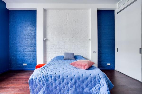
A bedroom that feels calm before you switch off the light can make the end of the day easier. Colour is only one part of good sleep hygiene, but it shapes the mood of a room and affects how bright, busy or restful it feels. The best calming bedroom colour scheme is not about finding one supposedly sleep-inducing shade. It is about building a low-stimulation palette that feels comfortable in your light, then supporting it with soft textures, gentle lighting and an uncluttered layout.
Start with colours that lower visual intensity
Restful bedroom colours are usually muted rather than highly saturated. Pale blues, dusty greens, warm stone shades, oatmeal, mushroom and gentle off-whites all work well because they give a room character without demanding attention.
This does not mean every bedroom needs to be pale. A deeper colour can still feel cocooning if its undertone is soft and the rest of the room is restrained. A smoky blue-grey behind the bed, for example, can create depth while lighter bedding prevents the space feeling heavy.
Why soft blue works so well in bedrooms
A soft blue bedroom often feels airy and quiet, especially when the blue has a grey or slightly green undertone rather than a sharp, icy finish.
In a south-facing bedroom with strong daylight, muted blue can cool the visual temperature without feeling stark. In a darker north-facing room, however, blue may appear colder than expected. Test a large sample on more than one wall and look at it in the morning, afternoon and evening before committing.
Pair blue with warmer supporting tones
If an all-blue room feels too cool, bring in warm beige, soft taupe or natural oak. One practical combination is muted blue walls, warm white woodwork, oatmeal bedding and medium-toned timber bedside tables. The blue keeps the room fresh while the warmer elements prevent it from feeling clinical.
Use dusty green for a grounded feel
A dusty green bedroom can feel especially restful when the shade leans towards sage, eucalyptus or muted olive. Green works naturally with linen, cane, oak, wool and clay-toned accessories, creating a grounded scheme without needing an obvious botanical theme.
Keep the undertone in mind. Greyed sage tends to suit cooler schemes, while olive or mossy greens sit more naturally beside warm neutrals. For a subtle look, use green on the walls and repeat it only once or twice elsewhere. Repeating the colour everywhere can make a muted palette feel overly coordinated.
Try green as an accent first
If painting every wall feels like too much commitment, use dusty green behind the headboard and keep the remaining walls warm off-white. This gives the bed a visual anchor and lets you test whether you enjoy the colour before extending it through the room.
Build a warm neutral bedroom with depth
A warm neutral bedroom can be calming, but it needs variation to avoid looking flat. Instead of relying on one beige across every surface, layer related shades such as warm white, sand, oat, putty, camel and pale brown.
Texture matters more when the colour range is narrow. Linen bedding, a wool throw, a fabric headboard, timber furniture and a woven rug can all add depth without introducing busy contrast.
Combine blue, green and neutrals without visual clutter
You do not have to choose between these palettes. Some of the most restful rooms use a warm neutral base with one muted colour layered over it. Think soft stone walls with dusty blue bedding, or pale blue walls with beige curtains and natural wood furniture.
A simple rule is to let one colour dominate, one support it and one appear only in small amounts. This creates hierarchy. When every shade has equal visual weight, the room can start to feel more decorated than restful.
Use the bed as the palette anchor
Because the bed is usually the largest visual feature, choose its colours early. If you already own patterned bedding, pull the quietest shade from it for the wall colour. If your bedding is plain, the walls can carry more personality. This sequence reduces trial and error and helps curtains, rugs and accessories feel connected.
Lighting can change the palette completely
Paint charts are only a starting point. Daylight direction, window size and bulb temperature can make the same colour look clean, dull, greenish or unexpectedly beige. Before decorating the whole room, paint large sample areas and live with them for at least a day or two.
For evenings, layered lighting usually feels calmer than a single bright ceiling light. Bedside lamps, wall lights or dimmable sources allow you to reduce brightness gradually.
Keep contrast controlled around the sleep zone
Strong black-and-white contrast, neon accents and several competing patterns can look exciting, but they may work against the quiet atmosphere many people want in a bedroom. You do not need to remove contrast completely. A dark wooden bed frame, charcoal lampshade or deep blue cushion can give the scheme definition. Use stronger tones sparingly and keep the area around the bed visually settled.
The same principle applies to clutter. Even the best calming bedroom colour scheme will struggle to feel peaceful if every surface is crowded. Leave some breathing room on bedside tables and dressers so the palette has space to do its job.
FAQ
What is the most calming colour for a bedroom?
There is no single colour that guarantees better sleep for everyone. Muted blues, dusty greens and warm neutrals are popular because they can create a softer, lower-contrast atmosphere. The best option is one that feels comfortable in your room’s natural and artificial light.
Is blue or green better for a restful bedroom?
Both can work well. Blue often feels fresh and airy, while dusty green can feel grounded and natural. Choose according to the room’s light, your furniture and whether you prefer a cooler or warmer mood.
Can a dark bedroom colour still feel calming?
Yes. Smoky navy, deep olive or muted charcoal can create a cocooning effect. Balance darker walls with softer bedding, warm lighting and enough lighter surfaces to avoid a heavy feeling.
Should the ceiling match the bedroom walls?
It can, especially if you want an enveloping look, but it is not essential. A warm white ceiling keeps the room feeling lighter, while using the same muted colour on walls and ceiling can create a more intimate effect.
A calmer bedroom starts with balance
The best bedroom colour schemes work because wall colour, textiles, timber, lighting and contrast support the same atmosphere. Soft blue can make a room feel fresh, dusty green can add a grounded natural quality, and warm neutrals can create a gentle cocoon when layered with texture.
Choose the direction that suits your light and furnishings, test it at different times of day, and keep stronger accents controlled. That measured approach creates a bedroom that feels visually quieter and more personal, supporting a relaxed evening routine rather than relying on any single paint colour.